So I went with black.
Now alarm bells are ringing.
Yellow and black.
Do I really want to spend weeks beading something that will look like a hazard warning sign?
Or as though I've skinned a thousand bees?
No- so my first challenge with this piece is to come up with a colour combination I like- so out come the beads.
- Yellow and black- already I have given this a big no
- Yellow, orange and black- not really much difference
- Yellow, orange reds and black- this is a colour scheme I have planned for another project later on so don't want to use it here and be sick of it before then
- Yellow, violet and black- too bold. I'm wary of the black being such a strong colour that I need to bring it down in some way and create something that is appealing with yellow rather than shocking.
So after a long time playing with my colour wheel and looking at lots of different schemes I decide to resort to google for ideas.
Googling "yellow colour schemes" I get the following:
http://desktoppub.about.com/od/colorpalettes/l/blcpyellow.htm
The first colour scheme is the yellows and reds I have already rejected but I like the next two and the use of the greys and blues- but I don't really want to use oranges as I don't want this to be an analogous scheme.
Next I get: http://www.colorcombos.com/yellow-color-schemes.html
There are lots of ideas here but no way I can see of narrowing it down to ones with yellow and black without scrolling through lots of pages and I need to leave with my beads in a few minutes.
So onto: http://www.squidoo.com/colorcombos where I can choose different colour combinations with yellow. But none with black so I move on but will definitely return here for future ideas.
http://desktoppub.about.com/library/weekly/blcplimited.htm gives me a yellow and black theme but just using shades of yellow- nice but not what I want. The black crystals I'm using will be very large in the piece and I think I prefer this idea with less black.
More on yellow and black here which gives me the idea of adding shades of grey- I like the thought of this.
This website confirms my worries about using black and yellow- I do not want this piece to pop!
So I begin searching for colour meanings etc with yellow- lots of great info here but no time to read it.
In desperation- I really do have to grab some beads and go- I turn to Colour Lovers.
Perfect!
Their blog post for yesterday was on "thin line colour schemes" and as I'll be using my new crystals as lines in my work I am delighted- this is just what I want.
On this one page there are so many ideas I have to try and narrow it down!
I love:

Color by COLOURlovers
Black with colors- but maybe too bold still and I want the yellow to be the main focus

Color by COLOURlovers
Having fun- too subtle maybe and my yellow are stronger

Color by COLOURlovers
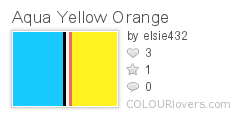
Aqua Yellow Orange- again maybe too strong and too much aqua

Color by COLOURlovers
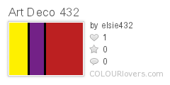
Art Deco- wow- but too like the analogous scheme I plan to use later

Color by COLOURlovers
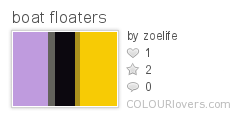
Boat Floaters- perfect- just what I want
This combines yellow and black with lavender, khaki and grey- just what I was looking for- the khaki colours were something I hadn't thought of and really make this palette.
So beads selected I'm off and raring to go
No comments:
Post a Comment