I
posted recently on my blog about not liking using certain colours.
There are some that just don't do it for me:
-wishy-washy blue
-plain baby blue
-hideous bright white
-nothing crystal
-dull baby pink
I guess my dislike of them is obvious from the "names" I give them!
Thinking more about the colours I don't like, and their similarities, makes me realise that what I don't like is the subtle, clear, absense of colour type colours- if that makes sense.
Imagine some crystals - shiny but with such little colour they look clear. That is what I try to avoid.
It's not necessarily one specific colour but I guess it's more obvious with pastels.
I hate when summer fashions come into shops and they're all pastels. I don't mind pastels but there's something about the thought of dressing head to toe in them that sends chills down my spine.
In fact I don't mind pastels or subtle colours- look at some of these gorgeous pastel colour palettes:
 Color by COLOURlovers
 Color by COLOURlovers
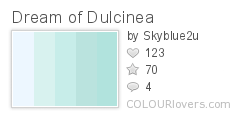 Color by COLOURlovers
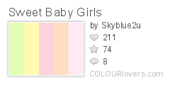 Color by COLOURlovers
Now add a touch of spice, contrast or something stronger, and pastels can even make my heart race:
 Color by COLOURlovers
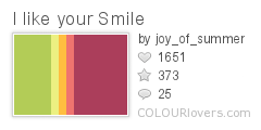 Color by COLOURlovers
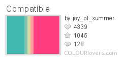 Color by COLOURlovers
 Color by COLOURloversColor by COLOURlovers
I guess on a screen it's impossible to represent that clear, absence of colour which is why I like these palettes. Turn them into almost clear crystals and suddently I want nothing to do with them!
What colours just don't do it for you?

