Saturday 27 November 2010

Beading In The Dark

Having finished one new version of my Geometric 1-9-1 pendant I was itching to rush on with another one and grabbed another crystal as well as some cylinder beads which all looked as though they worked together and got to beading.

Come the morning and better light it was obvious the combination didn't work too well- but what to do?

The crystal I had chose was black on one side with a blue/ green coating on the back - or so I thought.
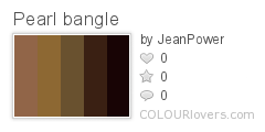
The main cylinder beads I chose were almost black with a subtle green sheen- again this was what it looked like to me late at night in the dark.
The other cylinder beads were a gold which I felt would zing out between the dark colours- can you guess where this is going?

Fortunately I stopped beading before I secured the crystal in which meant I got to have a good look at it in the daylight and my errors soon became apparent:
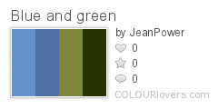
The crystal was indeed black but the back was definitely blue/ silver- no green in sight.
The main cylinder beads were definitely a forest green.
The gold cylinders were definitely a red/ brown.
The combination just did not go!


Well, the black on the front looked ok but the back of the work was all wrong and in a double-sided pendant I wanted to get it right. The beadwork was warm and green with gold and the crystal was cool with blue and silver.

What to do?

Fortunately I had a few other crystals (good job I was so indecisive when buying them and bought all I liked!)

You can see the fronts of the crystals here:

The backs of the crystals here:


As the beadwork wasn't finished I was able to put in the crystals to see what each one would look like:

The green I felt was far too "limey" with a big hint of silver for the forest green in the beadwork.


I liked the amber/ brown but if I had been going to choose this colour from the start I would have swapped the green and brown in the beadwork as I like the outline of the star pattern to really stand out and I was worried it would be lost against the crystal. In real life the crystal look smuch darker and more closely resembles the brown cylinder beads.


The clear had too much of a lilac look to it which just didn't go at all.


So I was still wondering what to do.

In the end I settled for the green and hoped it would work.

But a few rows on I just wasn't happy. The greens didn't work together and I hated it.
Deep down I knew the only combination which would work was the amber crystal and I threw away all my prejudices about wishing I had swapped over the colours in the scheme and out the crystal in and carried on beading.

A few rows on...

I loved it!

The colour scheme works perfectly and I am pleased to say that the star outline still stands out as although the colours of the cylinder beads and the crystal are close the fact that one is so transparent whilst the other is opaque means they look different.

Friday 26 November 2010

Geometric 1-9-1 version 2

When I first beaded my Geometric 1-9-1 back in early 2009 I used browns and golds as these were the colours of the crystals and small cylinder beads I had access to.

Ever since then I have wanted to bead another one in less sublter colours and finding some great crystals in New York recently as well as teaching it as a class was all the incentive I needed.

This one I beaded using a very light, transparent green cylinder bead combined with a steel-grey/ silver hex bead.

The crystal I chose is clear but has a gold/ green coating on the back which gives it a great light green/ gold AB shine.

As the green cylinder beads were so transparent I used a dark green thread throughout to ensure they would not "lose" any colour as I used them.

On the back of the piece I added extra rows using the contrast bead as I wanted to see it more and also as I wanted to see less of the crystal for an experiment in how that changed the look.

On the finished piece the silver beads look as though they are actually gold/ bronze as they reflect the green and gold of all the surrounding beads so much- no silver in sight!

Monday 1 November 2010

More Gaudi Colours

After my recent experiments with Gaudi colours on my geometric vessels I have decided to bead some more of them in a different shape but with the same colours.

For these I decided to bead two different ones which are exactly the same size, shape and colours- the only different being that I would reverse the colours scheme.


The first pendant uses a very light, white cream as the main colour with a mix of the oranges, blues, black and yellow that I used for my previous pendants.

The second pendant swaps around the scheme with the mix of colours being much more dominant with the end result that the cream looks a lot whiter and even "harsher" with the lines seems to jump out from the vessel.

Thursday 28 October 2010

Gaudi Colours

I am busy working on the project I will teach at my "Inspired by Gaudi" beading retreat in September 2011.

When deciding on a theme for the retreat Gaudi seemed an obvious choice because of the geometry of his work and his use of mosaic and colour.

I have decided to bead a geometric pendant which can be opened.

My colour inspiration came from this photo and I decided to use a strong orange (which was shiny) a blue (also shiny), black (once again, shiny) and yellow (yep, you guess it, shiny).

Now, I know from experience that too much shiny is not good for a project so I added in a matte orange to try and counteract all the shine.


Here you can see my first attempt using these colours:


Not good!
As I thought, all the shiny beads meant that the pattern and different colours were lost in the mix.

So next I moved onto using much more of the matte orange beads:


This was much more successful
This time at least you could see the structure and pattern much better and I was happier.

However, I felt that the colours looked a bit "muddy" and none of them stood out and "zinged" as I felt the colours did in the photo.

So I decided to add in white (more of a creamy-white as I felt white would be too hard):


I love this!


I think the oranges, yellow and blue stand out much more- even though there's far less of them.
It's amazing how the simple addition of another colour can completely alter the look of a piece.


Thursday 21 October 2010

Crystal Wheels


These beaded beads are definitely my new addiction!
I have been beading different coloured variations of them for a few months now but was limited by the colours I could get hold of.
But I recently found a new supplier of the crystals so have a whole new palette to play with!

My first choices of colours were this coral red, the lovely blue, silver, gold and copper

I mixed and matched them to come up with three different variatons using appropriately coloured seed beads:


I combined the coral red with gold and a dark gold seed bead for a rich, warm look


I paired the blue with the silver and dark grey seed beads to bring out the cold shine in all the colours


I also paired the blue with the copper and dark gold seed beads to change how the blue looks. In this variation I think the blue reflects the copper and gold and becomes much warmer. Wht do you think? Compare it with the blue in the picture above and let me know.

These will be launched as a kit very soon so sign up for my newsletter to find out when- and keep an eye out for any other colour variations I come up with!

Wednesday 29 September 2010

Oops...

... it's been a while!
but in my defence none of my recent work has seemed to be very "colour based" so I didn't feel I had much to update you with

But here are some of what I have been working on with some words on the colours I used:


Interlocking Crystals
Usually I try to completely avoid galvanised beads but when I was beading my samples for this project I was just drawn to them.
Fortunately as I beaded it (a good 150-200 hours) none of the coating came off so I hope they stand the test of time for a while longer!

For this piece I knew I wanted an opulent look and olivine is one of my favourite crystal colours so I figured if I was going to spend a lot of time looking at it as I worked it might as well be a colour I loved.
I paired the green with silver rather than gold partly because I prefer it, and the necklace wire I had was silver-coloured, but mainly because I wanted a brighter look and felt silver would give me this.


Interlocking Crystals bangle
Having worked for so long on the necklace using just two colours I was desperate for a change!
So, for this bangle I chose to use a wide range of colours of crystal and resisted the temptation to pair them with silver
Instead I added in black and white (well, a very light grey really- I usually avoid white as I find it too harsh) to use as neutrals.


Work in progress
This crystal and geometric piece is still very much a work in progress.
I chose to pair the "crystal coloured" crystal with silver as it match the "cold" look of the crystal and when it came to the other colour I resisted what would have been my usual choice- green- to instead use a blue which works with the silver but also has a finish with brings in some other colours to add extra interest

Thursday 8 July 2010

Even More Yellow And Violet

Ok, I admit it- I am in love with this colour scheme!

I needed to finish a bangle, make another bangle and also some more little beaded beads for a new pattern which will be available to purchase soon.

I had already made the bangle in violet with some yellow so just added extra yellow to that to finish the outside edge off.

Then what colour to do the other bangle in?
Well, obviously yellow was what came to mind!


This one I wanted to bead in an analogous colour scheme so used yellow, orange and brown which is much subtler than pairing yellow with violet.

The beads I am using are firepolished with some being a lot sparklier than others which gives extra interest to the finished pieces.

Thursday 24 June 2010

Yet More Yellow And Violet

I have finished my three bangles and as I said last time I went back to working with yellow and mixed it with violet for one of my favourite colour combinations.

I used size 8 seed beads mixed with yellow lentil beads in two different patterns.
To add extra interest to the seed beads I mixed two different finishes: a metallic and a plain dyed.

Sunday 20 June 2010

13 Months Of Colour

Ok, I admit it, time has just slipped by and I haven't been able to keep up with the challenge.

Life got in the way.

I originally planned to spent a year looking at 6 different colours (yellow, orange, red, violet, blue and green) dedicating two months to each colour.

I did ok with yellow, orange, red and even managed to squeeze in some violet but by the end of 2009 life got a lot more hectic.

Add in travelling a lot for work, Christmas and the magazine I was working for upping the number of issues by 33% and I barely found much time for beading and any I did do was often dictated by other factors and I wasn't able to devote the time to it I wanted.

So, I have decided to wind it all back in and go back to the start and change the parameters.

So, rather than dictate a set amount of time to each colour, I want to work with each one until I personally feel I have learnt all I can about it.

This will hopefuly stop me rushing through a colour, as I felt I did with yellow, to meet the schedule when I would rather play with it more.

So, in celebration of this I have gone back to yellow and violet!

These are two colours and a scheme I fell in love with all the way back at the start which surprised me.

I am in the middle of beading a set of three banngles which use each colour to different amounts.


Saturday 19 June 2010

Dagger schemes

I'm still working on my "Faux Crochet" technique and have made these two reversible bangles which use quite similar schemes- lots of browns, pinks and golds.

The first one uses gold dagger beads which also have hints if pinks and purples on them. I teamed these with brown hex beads in shiny and matte.
Gold_Daggers

My second one uses pink daggers beads which have swirls of other colours running through them. I teamed these with seed beads in pinks and browns.

Pink_Daggers

Keeping to the same colour scheme I have also beaded this bangle using pearls in lost of shades of chocolate brown, pinks and greens.


Pearl_bangle

Monday 14 June 2010

Neutrals

I'm working on a new technique: "Faux Cro" a lot at the moment and also putting together some work for an new thing I am launching soon.
I am conbining the two with some lovely colourful beads I bought last year in New York.

The beads are so colourful I knew as soon as I bought them that I wanted to pair them with these black and white seed beads as the perfect "neutral" background.

Wednesday 2 June 2010

St Valery Sur Somme

I'm over in France and I don't know if it''s a combination of the sunshine, rest and good food and drink but this town oozes colour!
I seemed to spend the day coming across unexpected dashes of strong colour amidst all the natural schemes.

I have spent the day taking photos which I hope will provide colour inspiration for future projects.The sky before we set off:

Blue_and_green

The view over the water:


St_Valery_Sur_Somme

Some colourful shutters:


St_Valery_2

Garge doors:

Garage_doors

Painted bricks and shutters:


bricks_and_shutters

Some irises:


French_Iris

More painted brickwork and shutters:


Bricks_shutters_2
Color by COLOURlovers

Tiles:

French_tiles


Bright shutters:

Shocking_French

A boat on the water:


Boat_on_water