Monday, 31 August 2009

St Petersburg Pots

For the next issue of Bead I'm making little pots using St Petersburg chain- an old project I came up with a few years ago but never did anything with.
So of course I'm working them in orange, brown and yellow- trying to keep to the challenge!

Sunday, 30 August 2009

Onye 3

I'm on an Onye Roll!

As soon as I came up with original pendant I knew I wanted to bead a version with eyes in.

It took me a while but I eventually manged to track down ones in the right size and colour, now how to complement blue eyes?

Well, orange and blue are complemenary colours so they work perfectly. But after already beading 2 of these in strong oranges I wanted to tone it down so based the sheme on browns and oranges.

This pendant will appear as a project in issue 19 of Bead magazine.

Thursday, 27 August 2009

Onye 2- (Tropicalimso)

Well, she's all done and I love her!

In the end I used orange, pink, teal and gold- sunshiny, happy colours.

This will appear as a project in issue 19 of Bead magazine.

Orange, pink and ?

I know for my next version of my Onye pendant I want to still use orange but don't want to make it too similar to the one already beaded- which just used oranges and yellows.
I have often loved the colour combination of orange and pink- such as the jewellery in this photo:


But I want to see if I can come up with a scheme that uses 'colour rules' and both those colours which I like.

My previous pendant was boldly orange- so this time I want to see if I can use orange in a more subtle way.

So I headed to Color Scheme designer.

Putting in a bold orange gives me this at first- nice but basically too orange
A complimentary scheme is this- nice but I want to throw in at least one more colour
Triadic results in this- still too bold
Tetradic- again nice but still bold
Analogic- very nice- and the mustardy yellow/ orange tones it down for me
Accented analogic- yum! I love the tealy colour in there- my kind of colour combo!

But the search is still on.

A recent Colour Lovers blog post - on Tropicalismo- leads me to a fab colour combo:

Cell Division
Cell_Division
Color by COLOURlovers


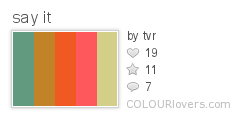
A search for orange and fuschia colour palettes gives me this:
say_it
Color by COLOURlovers

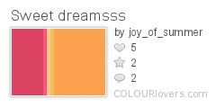
and this one
Sweet_dreamsss
Color by COLOURlovers

A google search for pink and orange colour schemes gives me some good results:

Here are some schemes using orange and pink also with white and yellow- very nice
This subtle orange and pink scheme make sme think maybe I need to tone down the fuschia?
Orange and pink in fashion
An orange and pink art challenge

Soon my head is spinning and I decide the only way to work out my colours is to actually look at what I own!
Check back to see what I end up using.

Saturday, 22 August 2009

Chocolates and macaroons

My last day in Paris and some colourful food

I ended up in the goumet food section of a department store and came across these wonderful chocolates and macaroons (from Patisserie Sadaharu)

I made my choice partly on flavour and partly on colour!


Thursday, 20 August 2009

2nd day in Paris

Still in Paris and a busy day before the start of my course (read more on my blog here)

These are some of the extra colour photos I took today.

The graffiti outside an exhibition at The Cartier Foundation- you could take any section of this for colour inspiration!

Some close-ups of La Fée Electricité (The Electric Fairy) by Raoul Dufy.


Blue to purple to green to yellow.

Red, Yellow and green.


Green and blues.


And on the look-put for oranges I found:

'Les Cing Sens' by Georges Valmier


'Composition' by Auguste Herbin

Wednesday, 19 August 2009

A day in Paris

I am in Paris, the sun is shining, I have no-one else to think about and no time to be home by. Could this day get any better?
Well okay, I could have found beads but that's a minor complaint!

It seemed that all around me today was colour. From the food I ate, to the museum pieces I saw, even down to the building works I walked by.

My mind was especially focused on looking for oranges as that is the colour I'm now working with, but that didn't limit the photos I took.

My trip to Paris began with lunch and this great colour combo of melon gazpacho- some sort of sweet sorbet (the taste bud explosion wiped out my memory of what it was) and yellow bread (not nice to eat but set the colour combo off great!)


My next stop was a visit to the Museum of Decorative Arts.

This cabinet of a dark oak with a strip of cobalt blue took my breathe away and I wish I had a picture that captured it better. I will definitely come back to this combo when I work in blue!


I love glass in many forms and this arrangement of mixed colours and shapes looked fabulous.


This piece of glassware with its two different 'blues' was interesting.


These multi-coloured works which used pink, blue, green and purple were, inspiring.


On the look out for orange combinations which appealed, I found this chair with its use of orange, white, yellow and a navy blue. I like the idea of the blue as I think black would have been too 'garish' or 'warning sign' if that makes sense- the blue definitely works to bring the sharpness down. Blue is orange's complementary colour.


More orange- here is orange, white and black- although I like this combination in the plastic I do think using navy- such as in the photo above- would have been nice and altered how the orange looked.


Here orange is mixed with a khaki green- I like this and would never have thought of it.


Once I'd finished in the musuem I was off to wander and take more photos.

I came across these wonderful blue doors and couldn't resist a photo- I think the redish-gold door furniture subtly makes this colour work so well.


Green and grey- who knew?


In a shop, looking for beads, I came across this range of jewellery focused on orange and pink- I think this is my favourite way to use orange!

Saturday, 15 August 2009

More love for yellow


From going to a yellow hater I am now definitely a yellow lover- more proof in the jumper I bought today- I liked lots of the colours but couldn't resist the yellow!

Thursday, 13 August 2009

Geometric 3-4-6 (boat floaters)


Finally!
This bracelet has taken me many months to make as I have been so busy when in reality I could have done it in a week- such is life.

I'm really pleased to have her finished, not only because she looks so nice, but also because she was a successful experiment in both executing the idea of using the larger beads inbetween the beaded triangles, but also in colour.

When I started this colour experiment I said I has never used yellow and hated it- well now I really have used it- and love it!

This bracelet definitelty changed my feelings towards yellow and I have learnt a lot about how to use it in a way I like it and that overcomes the problems I have with it.
Most of this was to do with combining it with the right other colours- so all my seeking out the right palette (and here) paid off.

I'm looking forward to using yellow a lot more in the future as I don't feel so "scared" of it now- so much so that I don't want to move onto orange!

Thank goodness I sneaked some in already so it's not all new to me.

Monday, 20 July 2009

Finishing up geometric piece and yellow

I'm persevering with my latest geometric piece and although I love the look of it and want it finished, I really want to move onto something else!

But I'm determined to get it done over the next few weeks- I think I have around another 10 triangle sections to go and they take around an hour each so not too much longer.

I'm beading this as part of my colour challenge and can't move onto the next colour- orange- until I'm done. Not that I think I want to now- I am loving yellow- never thought I'd say that!


Friday, 17 July 2009

Sneaking in orange


I've just finished a new project- my Onye pendant- which still uses yellow but sneaks in some oranges there as well- ok, mainly orange but seeing as I'm going to be moving onto that soon it's allowed!

Thursday, 16 July 2009

Geometric Beaded Bead all done


I started this geometric beaded bead a little while ago so it was nice to finally finish it.
As I have found with my other yellow experiments I had to add in "fake yellow" so that you could actually distinguish the colours from each other.

I was hoping to get another one done in yellow but seeing as I haven't finish my other geometric piece and I need to think about moving onto orange it may have to wait!

Friday, 19 June 2009

Crystal Worlds

Today I visited Swarovski's Crystal Worlds in Wattens, Austria.
One of the "rooms" featured a piece by Brian Eno called "55 million crystals" where a screen plays a constantly changing picture.
It was mesmerising to look at and I took lots of photos of it (and one of them using the negative setting on my camer) so here's a random selection for you to see- I have to make something inspired by this!


Addictive Colour Fun Website

This website search 10 million photos on Flickr to find those with the colours you choose- so even if you choose multiple colours it will find them in photos- a great way to waste hours!

Friday, 12 June 2009

More Fake Yellow

Today I visited Arundel castle and whilst in the grounds came across lots of yellow plants, flowers and foliage- except once again I didn't- it was that fake yellow phenomenon again.

Monday, 8 June 2009

Yellow Beading Experiments

Today I had planned to spend the day beading with my friend, Liz Thornton, and experimenting with yellow.
After a delayed start, due to work, I finally got to Liz's and in the afternoon we got cracking.

I recently went through my whole Delica bead collection (which is fairly large) searching for yellow beads and then went along to the London Bead Co (which has a large collection too!) and filled in any gaps and I had and the grand total of my yellow Delica bead stash now numbers ....

7 different tubes

Seriously- when I removed any golds, yellowy-oranges, yellowy-greens etc and just went for yellow I could only find 7. There may be more out there but I couldn't find them.

For reference the numbers of yellow I decided on are:
710- 751- 721- 854- 160- 232- 145


There were some other possibilities than you might think of as yellow, until you look at it again - and some of them were even labelled yellow:
233- labelled "lined crystal yellow" but to my eyes a definite orange rather than a yellow
1592- an orangy yellow
53- too orangy and creamy


and then there's one that I can't decide for sure:
424- metallic and quite golden at first sight- but I think this is a yellow- but is a metallic yellow automatically a gold?


Can you find any other yellow Delica beads? Contact me if you can- I'd love to know!

I found it really interesting to go through my stash and pick out eveything I thought was yellow and then examine all the colours again and pare them down to what is actually yellow.
I have found this a lot with yellow- Liz had taken some photos of yellow plants at the Chelsea Flower Show to show me but when we looked at them they weren't really yellow- lots of greens but no real yellow. We also noticed this whilst beading and looking out of the window- lots of the foliage etc that you woul have said was yellow was actually green at second glance - is yellow unique in this "fakery" I wonder?

As I looked at my small yellow stash it soon became obvious that two of them (145 and 232) stood out as different from the rest.
232- this was very creamy and white
145- looks yellow but look again it it seems to be very green- and also the finish means that it is very reflective and appears to have black stripes along its length.


So I was down to 5.

I wanted to bead small sections using the yellows by themselves and with other colours to see how they changed- or if they changed.

I began by peyote stitching 8 rows each in the yellows I had left.


But it soon became apparent that one of the colours- 710- stood out from the rest. This is a transparent bead and so was really being affected by the thread I was using, the other beads near it and whatever background I put it in.
In this photo all 3 strips are the same bead- just laid down on different backgrounds- a wooden table, a ligth coloured bead mat and a very light lilac gift-bag. None of the other colours were transparent and changed this much on different surfaces.


Although I wanted to see if the beads changed, it was more to see if our perception of them changed rather than them actually changing due to an outside effect. So for my next swatch I took this bead out- leaving me with only 4.


I next beaded a swatch using the same yellows but this time surrounded by 799- a dark violet colour. I was really surprised that there seemed to be no change- the yellows looked the same.


Unfortunately I then ran out of time so only got a chance to begin a new swatch using a pumpkin orange- but as soon as I get a chance I'll be back to update this post!