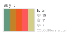
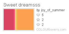
For the next issue of Bead I'm making little pots using St Petersburg chain- an old project I came up with a few years ago but never did anything with.
So of course I'm working them in orange, brown and yellow- trying to keep to the challenge!
Monday, 31 August 2009
Sunday, 30 August 2009
Onye 3
I'm on an Onye Roll!
As soon as I came up with original pendant I knew I wanted to bead a version with eyes in.
It took me a while but I eventually manged to track down ones in the right size and colour, now how to complement blue eyes?
Well, orange and blue are complemenary colours so they work perfectly. But after already beading 2 of these in strong oranges I wanted to tone it down so based the sheme on browns and oranges.
This pendant will appear as a project in issue 19 of Bead magazine.
Thursday, 27 August 2009
Onye 2- (Tropicalimso)
Well, she's all done and I love her!
In the end I used orange, pink, teal and gold- sunshiny, happy colours.
This will appear as a project in issue 19 of Bead magazine.
In the end I used orange, pink, teal and gold- sunshiny, happy colours.
This will appear as a project in issue 19 of Bead magazine.
Orange, pink and ?
I know for my next version of my Onye pendant I want to still use orange but don't want to make it too similar to the one already beaded- which just used oranges and yellows.
I have often loved the colour combination of orange and pink- such as the jewellery in this photo:
But I want to see if I can come up with a scheme that uses 'colour rules' and both those colours which I like.
My previous pendant was boldly orange- so this time I want to see if I can use orange in a more subtle way.
So I headed to Color Scheme designer.
Putting in a bold orange gives me this at first- nice but basically too orange
A complimentary scheme is this- nice but I want to throw in at least one more colour
Triadic results in this- still too bold
Tetradic- again nice but still bold
Analogic- very nice- and the mustardy yellow/ orange tones it down for me
Accented analogic- yum! I love the tealy colour in there- my kind of colour combo!
But the search is still on.
A recent Colour Lovers blog post - on Tropicalismo- leads me to a fab colour combo:
Cell Division
Color by COLOURlovers
A search for orange and fuschia colour palettes gives me this:
Color by COLOURlovers
and this one
Color by COLOURlovers
A google search for pink and orange colour schemes gives me some good results:
Here are some schemes using orange and pink also with white and yellow- very nice
This subtle orange and pink scheme make sme think maybe I need to tone down the fuschia?
Orange and pink in fashion
An orange and pink art challenge
Soon my head is spinning and I decide the only way to work out my colours is to actually look at what I own!
Check back to see what I end up using.
Saturday, 22 August 2009
Chocolates and macaroons
My last day in Paris and some colourful food
I ended up in the goumet food section of a department store and came across these wonderful chocolates and macaroons (from Patisserie Sadaharu)
I made my choice partly on flavour and partly on colour!
I ended up in the goumet food section of a department store and came across these wonderful chocolates and macaroons (from Patisserie Sadaharu)
I made my choice partly on flavour and partly on colour!
Thursday, 20 August 2009
2nd day in Paris
Still in Paris and a busy day before the start of my course (read more on my blog here)
These are some of the extra colour photos I took today.
The graffiti outside an exhibition at The Cartier Foundation- you could take any section of this for colour inspiration!
Some close-ups of La Fée Electricité (The Electric Fairy) by Raoul Dufy.
Blue to purple to green to yellow.
Red, Yellow and green.
Green and blues.
And on the look-put for oranges I found:
'Les Cing Sens' by Georges Valmier
'Composition' by Auguste Herbin
Wednesday, 19 August 2009
A day in Paris
I am in Paris, the sun is shining, I have no-one else to think about and no time to be home by. Could this day get any better?
Well okay, I could have found beads but that's a minor complaint!
It seemed that all around me today was colour. From the food I ate, to the museum pieces I saw, even down to the building works I walked by.
My mind was especially focused on looking for oranges as that is the colour I'm now working with, but that didn't limit the photos I took.
My trip to Paris began with lunch and this great colour combo of melon gazpacho- some sort of sweet sorbet (the taste bud explosion wiped out my memory of what it was) and yellow bread (not nice to eat but set the colour combo off great!)
My next stop was a visit to the Museum of Decorative Arts.
This cabinet of a dark oak with a strip of cobalt blue took my breathe away and I wish I had a picture that captured it better. I will definitely come back to this combo when I work in blue!
I love glass in many forms and this arrangement of mixed colours and shapes looked fabulous.
This piece of glassware with its two different 'blues' was interesting.
These multi-coloured works which used pink, blue, green and purple were, inspiring.
On the look out for orange combinations which appealed, I found this chair with its use of orange, white, yellow and a navy blue. I like the idea of the blue as I think black would have been too 'garish' or 'warning sign' if that makes sense- the blue definitely works to bring the sharpness down. Blue is orange's complementary colour.
More orange- here is orange, white and black- although I like this combination in the plastic I do think using navy- such as in the photo above- would have been nice and altered how the orange looked.
Here orange is mixed with a khaki green- I like this and would never have thought of it.
Once I'd finished in the musuem I was off to wander and take more photos.
I came across these wonderful blue doors and couldn't resist a photo- I think the redish-gold door furniture subtly makes this colour work so well.
Green and grey- who knew?
In a shop, looking for beads, I came across this range of jewellery focused on orange and pink- I think this is my favourite way to use orange!
Saturday, 15 August 2009
More love for yellow
Friday, 14 August 2009
Thursday, 13 August 2009
Geometric 3-4-6 (boat floaters)
Finally!
This bracelet has taken me many months to make as I have been so busy when in reality I could have done it in a week- such is life.
I'm really pleased to have her finished, not only because she looks so nice, but also because she was a successful experiment in both executing the idea of using the larger beads inbetween the beaded triangles, but also in colour.
When I started this colour experiment I said I has never used yellow and hated it- well now I really have used it- and love it!
This bracelet definitelty changed my feelings towards yellow and I have learnt a lot about how to use it in a way I like it and that overcomes the problems I have with it.
Most of this was to do with combining it with the right other colours- so all my seeking out the right palette (and here) paid off.
I'm looking forward to using yellow a lot more in the future as I don't feel so "scared" of it now- so much so that I don't want to move onto orange!
Thank goodness I sneaked some in already so it's not all new to me.
Subscribe to:
Posts (Atom)